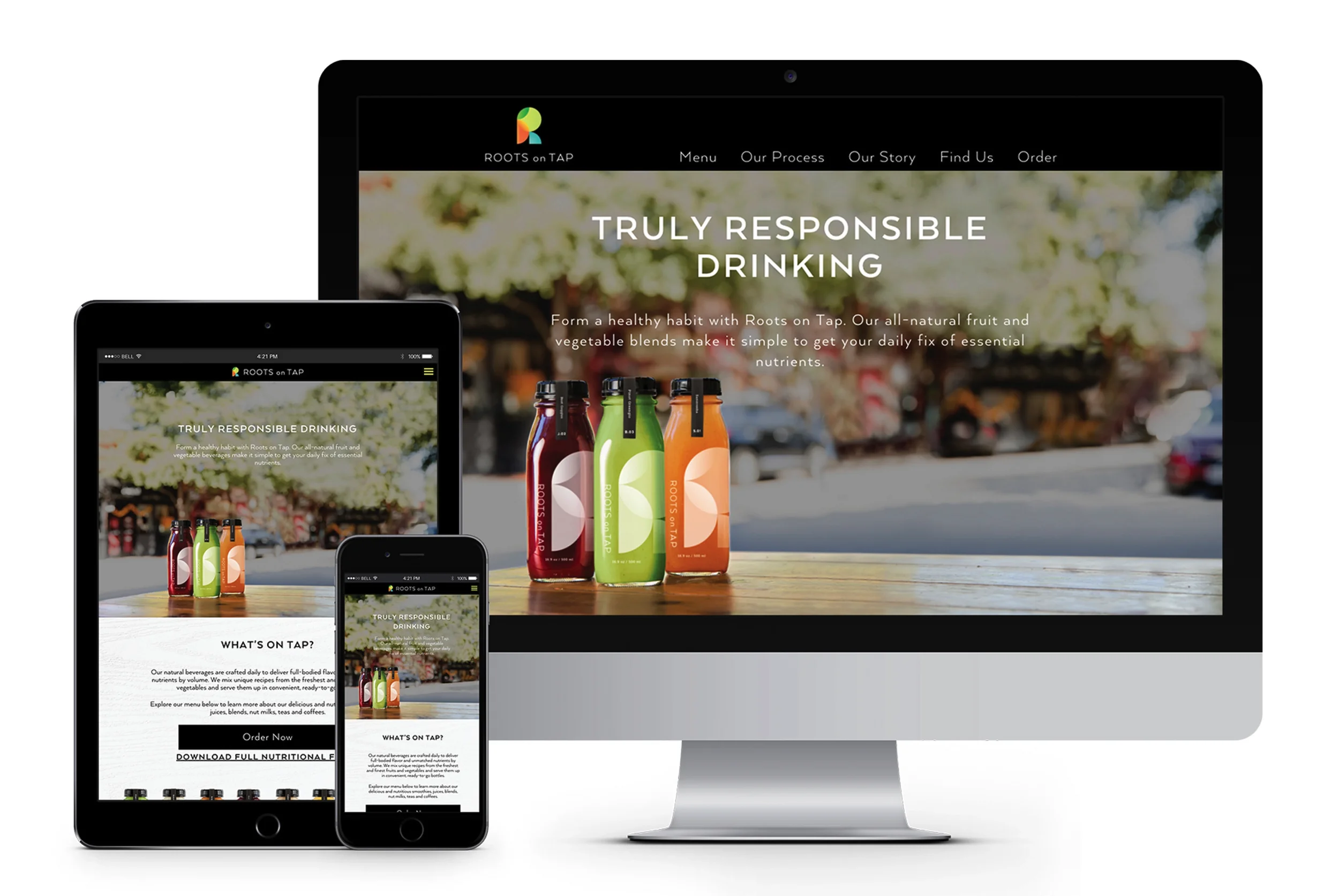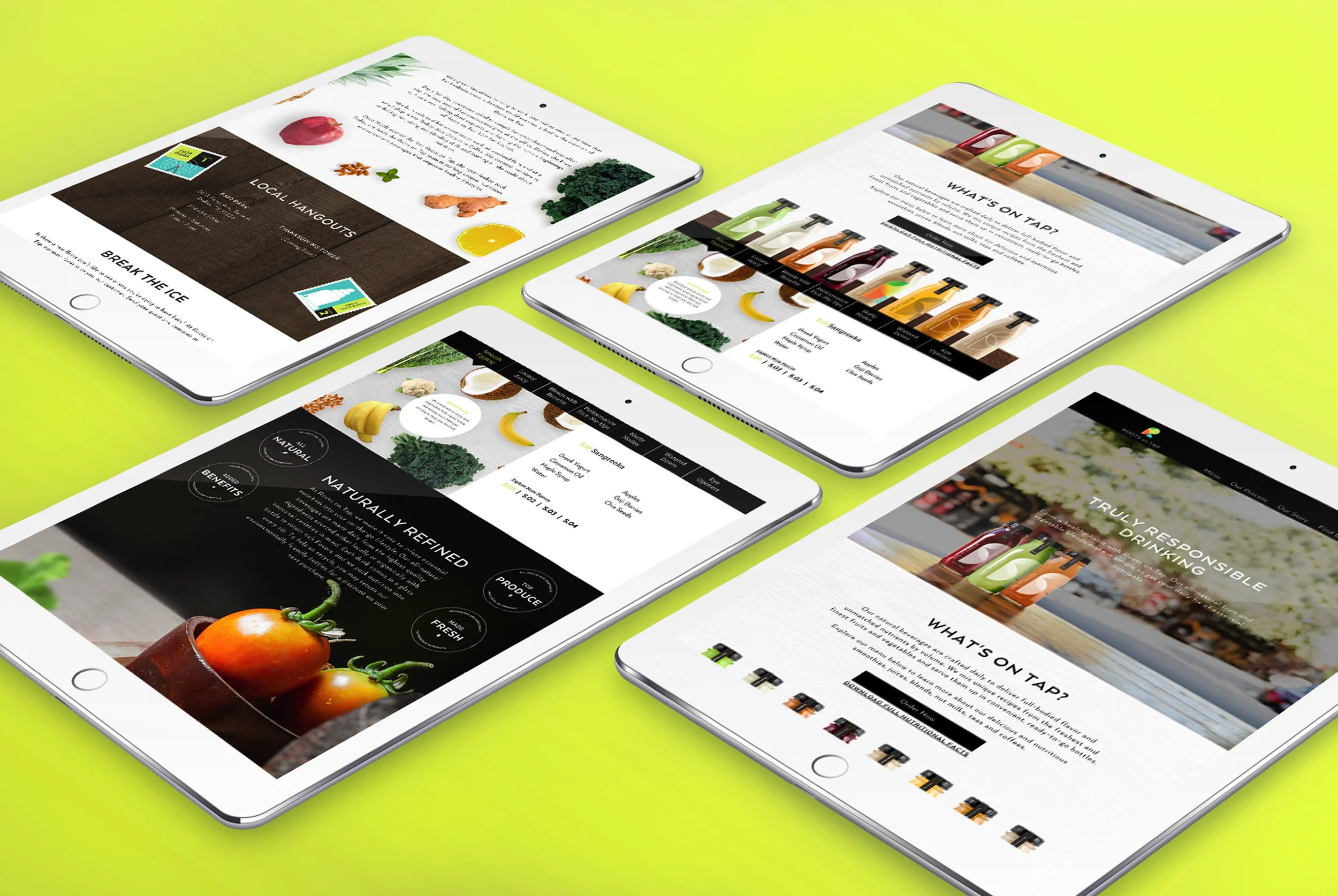
Roots On Tap
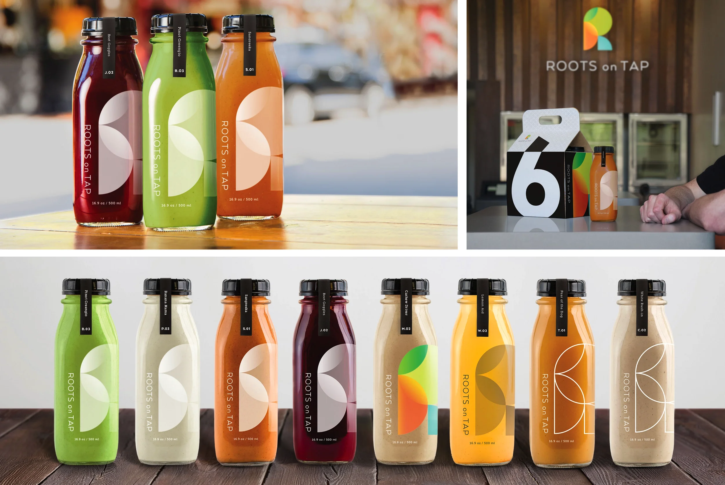
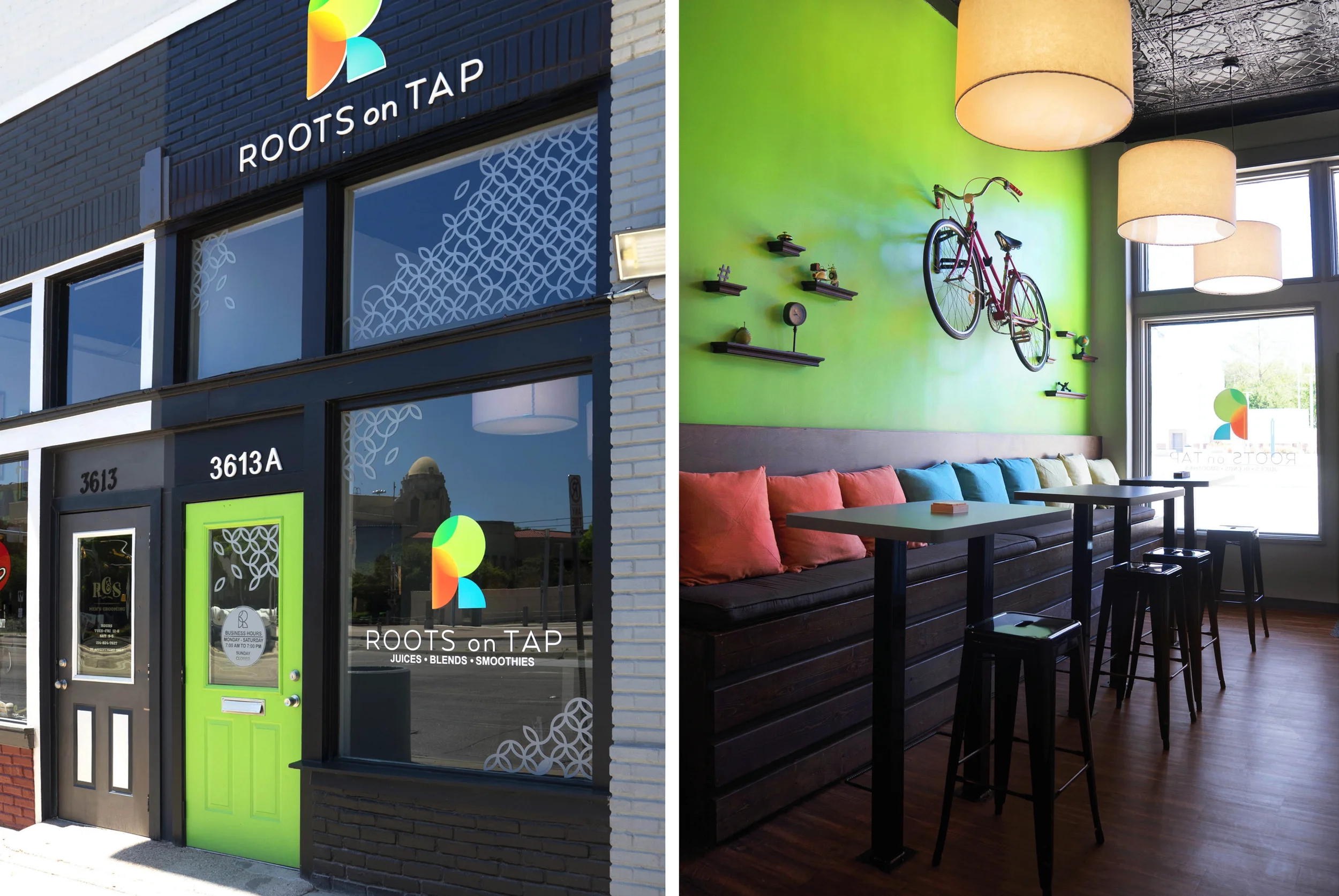
When a Dallas juice and smoothie guru decided to open her first storefront, my team was tasked with bringing her brand to life from the ground up. We started with a new name—Roots on Tap—and an image centered on a healthier cocktail alternative for “Truly Responsible Drinking.” From there, we set to work creating a cohesive brand platform to bring her products to market.
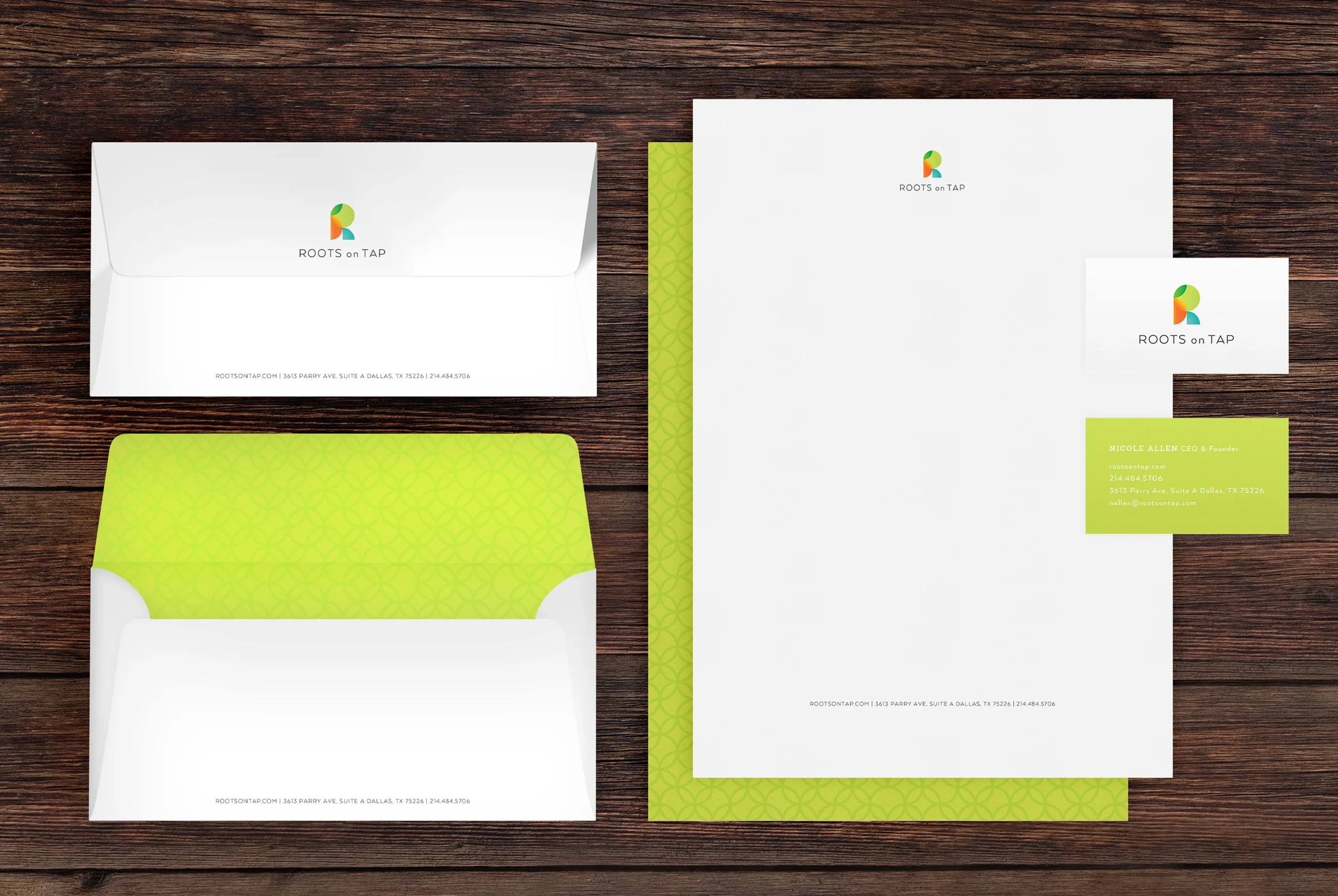
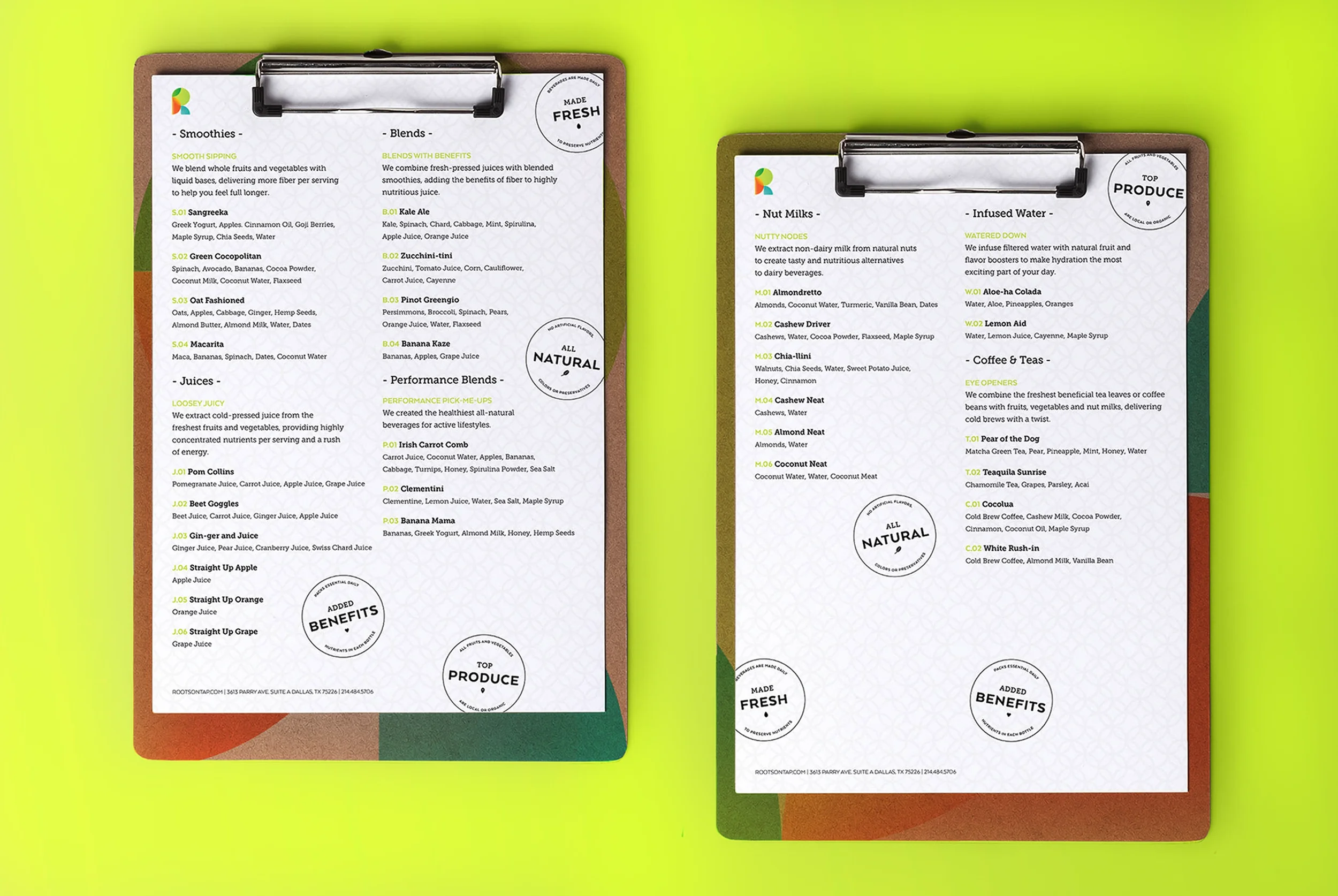
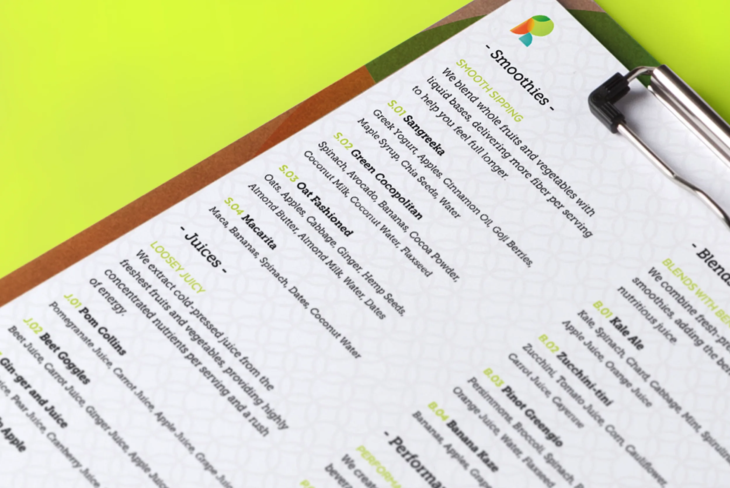
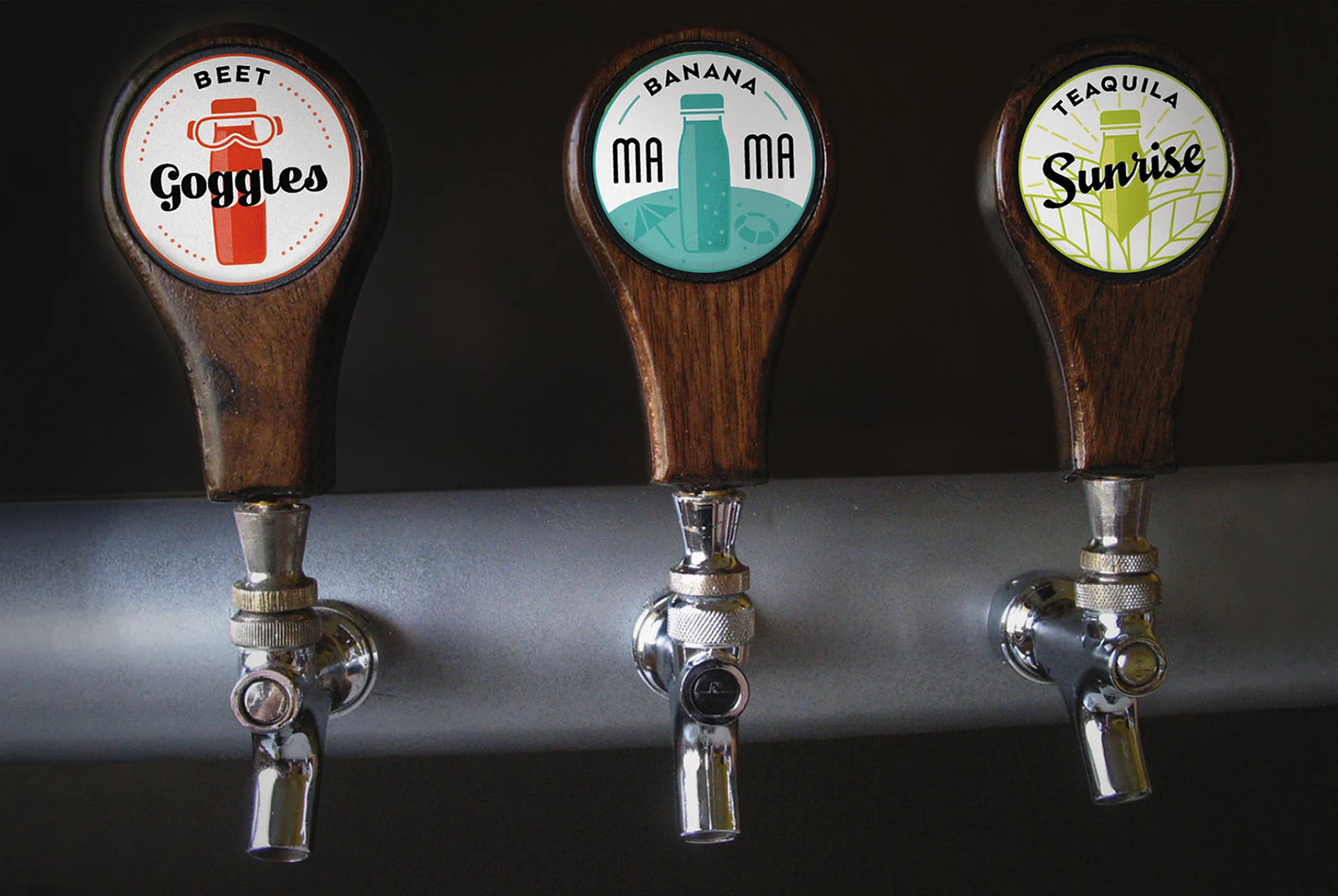
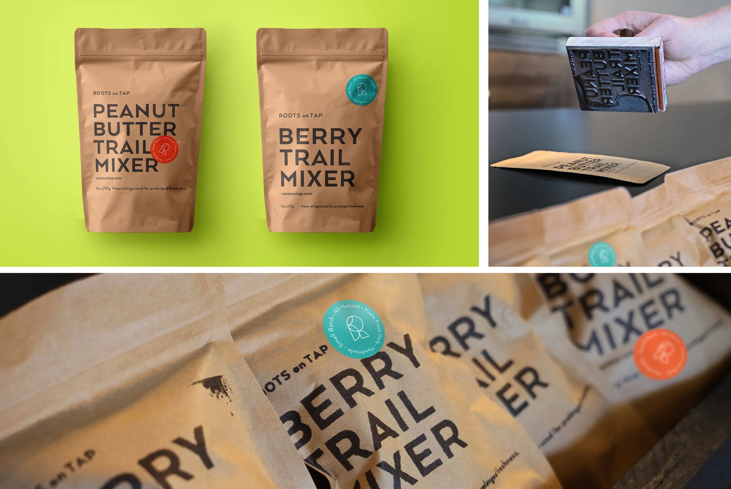
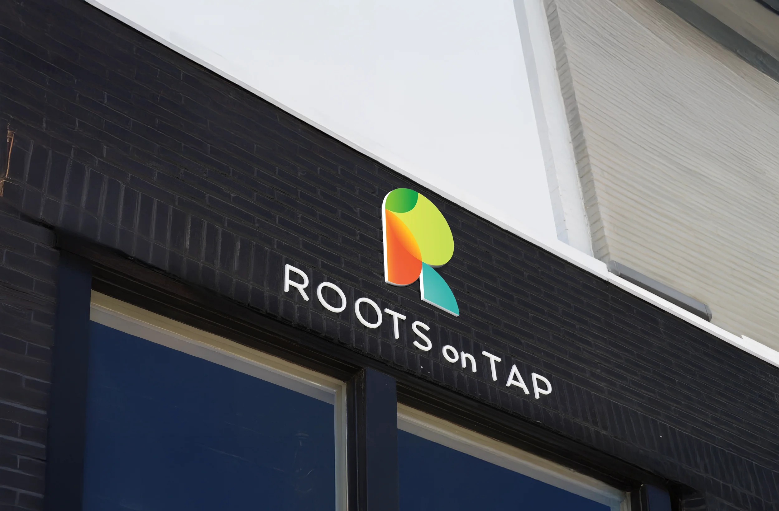
The result was a robust identity system that included the creation of a logo, stationary, packaging, storefront design and uniforms. With vibrant colors and clean, geometric shapes, the brand’s friendly and contemporary aesthetic communicated its wholesome promise to deliver refreshing and replenishing juice blends. At the same time, we carried the naming architecture into menu creation, pairing familiar cocktail names with fresh ingredients. These fun and memorable names, including Pear of the Dog, Oat Fashioned, Cashew Driver, and Pom Collins, worked systematically to advance a collective brand meaning that differentiated the new juice brand from the competition.
Creative Direction // James Harrison
Design // Becky Lin
Copy // Terez Leach
Photography // Kelsey Foster
Development // Dustin Carroll & Jeremy Williams
Agency // 70kft